Have you ever tried to explain something to someone and been met with confused looks? Have you ever tried to convince someone of something and struggled to gain their buy-in? I find a lot of times the reason for this is because the person you're trying to convince needs to see what you’re talking about to better understand it. The phrase, “a picture is worth a thousand words” comes to mind often in situations like this. Sometimes giving someone a visual can help get the point across better than a lengthy report or verbal presentation.
Decision-Support Products
The National Oceanic and Atmospheric Administration (NOAA) Water Initiative began in 2016 as a partnership across multiple sectors of NOAA to create and deliver science-based water information and decision-support services. Over the years, the Office for Coastal Management (OCM) has released several decision-support products that are accessed and deployed through various NOAA platforms. These platforms host and serve data in multiple formats and allow users to interact with the data in multiple ways.
Immersive and Engaging Out-of-the-Box Solutions
We recently helped NOAA OCM explore the possibility of incorporating the next generation of web-based information visualization and dissemination products into its suite of offerings. NOAA OCM wanted to examine the out-of-the-box capabilities within Esri’s suite of software tools to determine what would help its stakeholders analyze, visualize, and share data. The overall goal was to evaluate the viability of various Esri technologies and solutions to help organize and present NOAA resources related to community-based coastal issues, i.e. visualization. NOAA was hoping to see what tools would provide an immersive and engaging experience, what approaches might better organize and centralize its online resources, and solutions that could be developed faster and be easier to maintain.
Generally, when you think out-of-the-box, you don’t think immersive and engaging. However, using Esri’s built-in application building and design capabilities, we developed visually appealing and immersive protypes that look as if they were custom built. NOAA’s Josh Murphy, the project manager for this effort, remarked when seeing the complexity of the prototypes, “If you hadn’t already told me this was all done with out-of-the box features, I wouldn’t have believed it!”
Generally, when you think out-of-the-box, you don’t think immersive and engaging. However, using Esri’s built-in application building and design capabilities, we developed visually appealing and immersive protypes that look as if they were custom built. ”
Sid Pandey
Evaluating Esri Tools
During this task, we reviewed ways in which Esri’s tools could be used to develop new versions of NOAA’s Coastal Water Quality Snapshots, Coastal Inundation Toolkit, and Climate Change Explorer. Throughout the process, we documented the pros and cons of each Esri application, what functionalities could be used, and the limitations. Since we knew that our client was going to present our findings to other stakeholders at NOAA to generate interest and obtain buy-in, we developed digital prototypes that allowed them to demonstrate the proposed user experience.

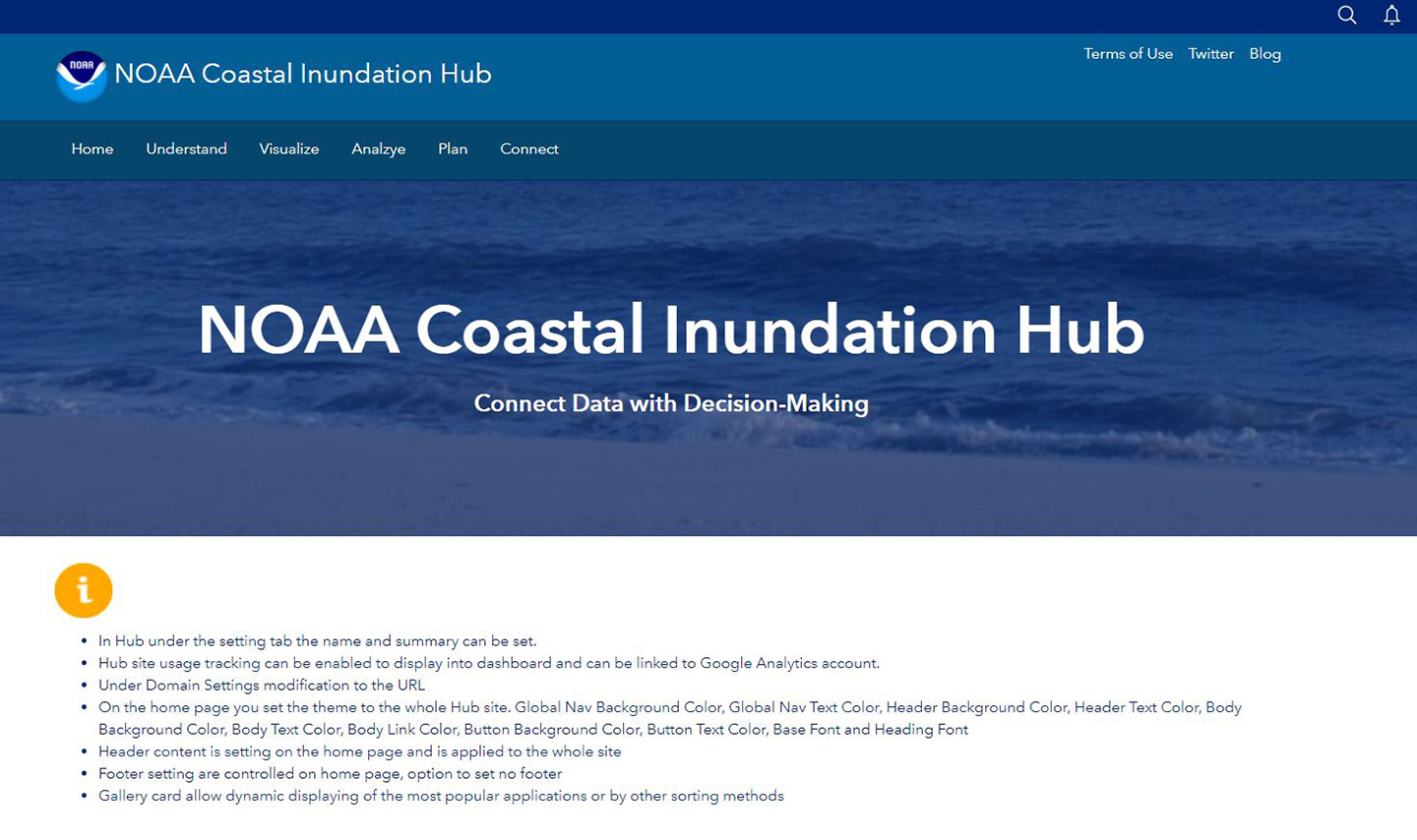
NOAA Coastal Inundation Esri Hub Prototype. Image courtesy of NOAA.
The Experience Builder
This project resulted in extensive research and documentation into the Esri ecosystem; we wanted to see where each tool was most applicable, and suggestions on how NOAA could reformat data to enable additional analytical capabilities. Rather than relying on screenshots, PowerPoints, or lengthy reports, we delivered our findings in an interactive way. We decided on Esri’s Experience Builder tool, which is user-friendly and allows users to develop map-centric or non-map centric apps using drag-and-drop tools that can be displayed on fixed or scrolling screens on single or multiple pages.

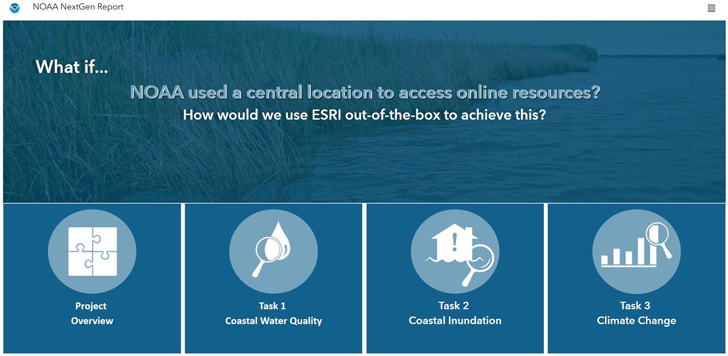
Experience Builder project report home screen. Image courtesy of NOAA.
Our Experience Builder report was developed to look like a website, providing narrative of the project’s objectives and findings, and direct links to each of the prototypes developed. Ultimately, we developed a digital report and published it within NOAA’s GeoPlatform so it can easily be shared and discussed further with stakeholders. Instead of a dry, 100-page report, NOAA can continue to socialize our prototypes in real time, showing why it’s important, and helping to obtain the buy-in needed to build the next generation of NOAA Coastal Water Quality, Inundation, and Climate Change applications.
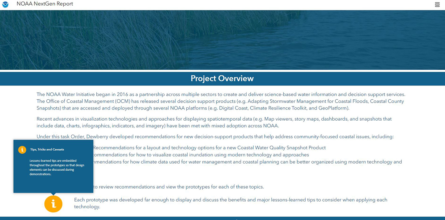
 Report narrative showcasing interactive popups. Image courtesy of NOAA.
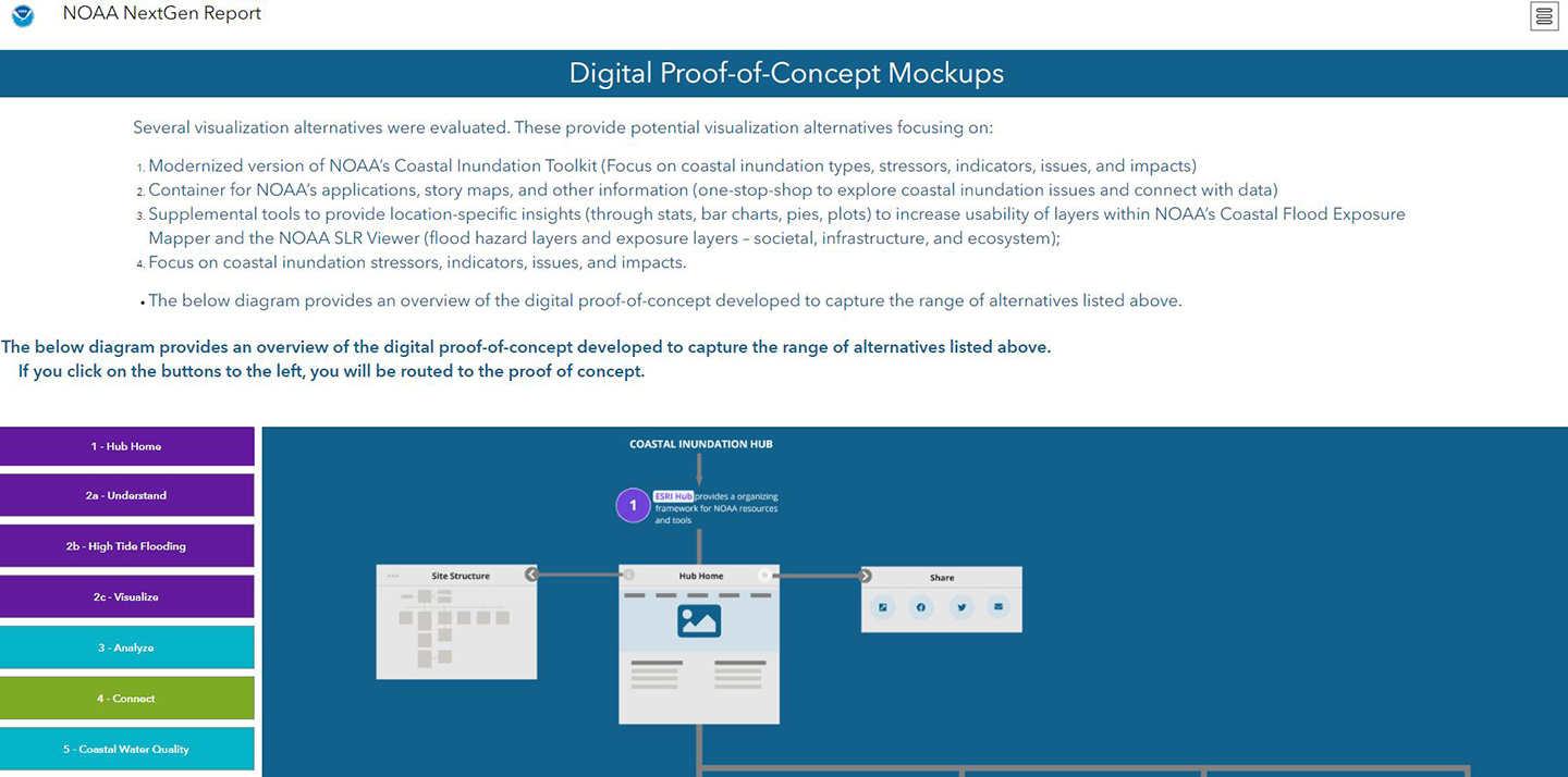
 Overview and direct link to each proof of concept. Image Courtesy of NOAA.
 Our NOAA NextGen collaborative team included Ken Logsdon, Alaurah Jordan, Ian Byers, and myself.