Recently, my team and I were tasked with performing a master plan and hydraulic model for a water utility whose service area covered 25 square miles and supported a population of 70,000. Our analysis of a 15-year planning horizon resulted in more than $50-million in recommended system improvements.
The Challenge: Graphically Representing Fire Flows
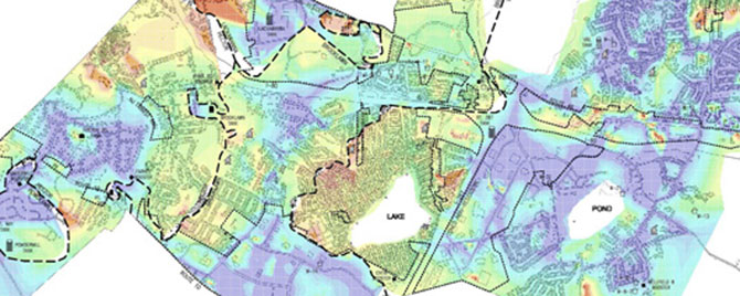
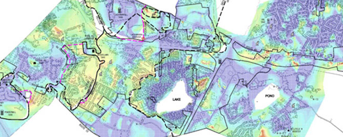
We used Bentley's WaterGEMS, a water distribution system hydraulic modeling program, to perform our analysis. However, attempting to graphically represent the fire flows—amount of flow of water the system could deliver for fighting fires—presented a challenge. To represent such a vast geographic area, the standard "contour method" we used for showing water system pressures would not be able to show the fire flows clearly and WaterGEMS did not have the built-in capability to graphically present the fire flows the way we wanted.
While researching an unrelated matter, I discovered a dasymetric map, typically used to graphically present information, such as population densities and weather, over a geographic map by using color to spatially classify data. The most common form of dasymetric maps are the temperature maps used by weathermen during news broadcasts.
A Labor Intensive Process
It turns out the process to get from WaterGEMS to a dasymetric map is labor intensive, but worthwhile. We exported our data from WaterGEMS with coordinates that labeled the horizontal locations and available fire flow rate. We then imported the information into Carlson Civil to generate a color 3D grid surface, using our data points where each corner of the grid represented a flow rate. Lastly, vector graphics were cleaned up in AutoCAD for our final presentation.

The dasymetric map was extremely useful for simplifying comparison of fire flow maps under existing conditions...

...and proposed conditions, to get a visual representation of the benefits of implementing the recommended improvements.